Brand · Visual identity
Brand Guidelines
This manual describes how the LBS visual identity is built and how to apply it: the logo and its approved variations, clear space and minimum sizes, the colour palette, typography, and the tone the lab uses when it speaks.
The identity belongs to the whole lab — papers, posters, slides, tools, and websites should look like they come from the same place. When in doubt, choose the simplest correct option and keep the logo clear of everything else.
Name and wordmark
The lab is “LBS” in short form and “Laboratório de Bioinformática e Sistemas” in full. The full name is institutional and stays in Portuguese in formal contexts, even in material written in another language; translations are there to help readers, nothing more.
- LBS
- Always in capitals, never “L.B.S.” or “Lbs”. Safe to use on its own once the full name has appeared.
- Laboratório de Bioinformática e Sistemas
- The official full name. Keep it in Portuguese on letterheads, agreements, and anywhere the lab is named institutionally.
- Laboratory of Bioinformatics and Systems
- Reading translation, used in English text. Equivalents: Laboratorio de Bioinformática y Sistemas (ES) and Laboratoire de Bioinformatique et Systèmes (FR).
- DCC · UFMG
- Always attribute the lab to the Department of Computer Science at the Federal University of Minas Gerais. Use a middle dot, not a slash or a hyphen.
The wordmark inside the logo is outlined artwork, not live text. It is always in Portuguese and is never re-typeset or translated.
The logo
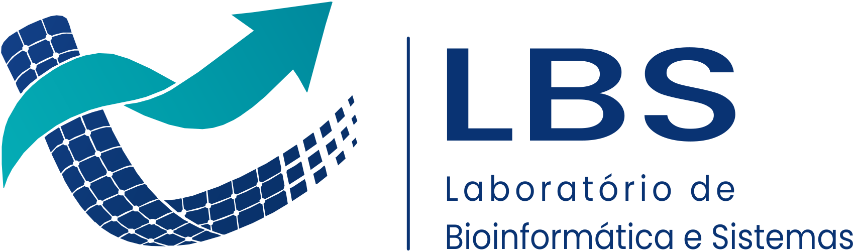
The identity has two parts: the digital symbol — the arrow rising out of a dotted globe — and the wordmark. They combine into three lockups and three colourways. Each version ships as an SVG, which scales without loss, and as a transparent PNG.
Horizontal lockup
Symbol to the left of the wordmark. The default for headers, footers, letterheads, and slide masters — anywhere the space is wider than it is tall. This is the version this website uses.
Colour
Default. Use on white and light backgrounds.


Navy
One-colour use: print without gradients, engraving, stamps, and monochrome documents.


White
On navy, dark, or photographic backgrounds. This is the version the site's dark theme uses.

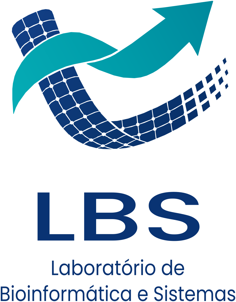
Vertical lockup
Symbol above the wordmark. Use it where the space is narrow or square — posters, roll-ups, badges, social profile headers, and the corner of a scientific poster.
Colour
Default. Use on white and light backgrounds.
Navy
Light backgrounds.

White
Dark and photographic backgrounds.
Symbol only
The symbol without the wordmark. Use it only where LBS is already named nearby, or where the space is too small for the full lockup — favicons, avatars, app icons, watermarks, and section markers.

Colour
Default, on light backgrounds.


Navy
One-colour use and very small sizes.


White
Dark and photographic backgrounds.

Clear space and minimum size
Keep a margin equal to half the height of the symbol free on all four sides of the logo. Nothing enters that margin — text, rules, images, or the edge of the page. When in doubt, give it more room, not less.
Horizontal lockup
144 px / 40 mm
Minimum width. This is the size the site header uses on small screens.
Vertical lockup
96 px / 25 mm
Minimum width.
Symbol
32 px / 10 mm
Minimum width. Below that, use the navy version — the gradient stops reading.
What not to do
The lockups are finished artwork. Scale them proportionally and leave everything else alone.
- Do not stretch, squash, or rotate the logo. Scale it proportionally.
- Do not recolour it outside the three approved colourways.
- Do not place the colour or navy lockup on a dark or busy background — that is what the white version is for.
- Do not re-typeset the wordmark. It is outlined artwork, not text, and it is never translated.
- Do not build your own lockup by moving the symbol and the wordmark apart.
- Do not add drop shadows, outlines, bevels, or glows.
- Do not crowd it. Respect the clear space.
- Do not put it in a white box on a coloured background when the white version could sit on that background directly.
Colour
The palette is deep blue and cyan for science, computation, and trust, and green for the life sciences. Orange is a rare accent — used to mark one thing on a page, never as a second brand colour. Purple, red, dominant black or grey, and neon are outside the palette.
Logo colours
Taken from the artwork itself. Use these when reproducing the logo or matching it in print.
LBS Navy
#093373
Solid navy — symbol and wordmark in one-colour use
Navy gradient
#123F86 → #082F68
Symbol body in the colour version
LBS Teal
#05ADB6 → #00889C
Symbol highlight in the colour version
White
#FFFFFF
Reversed logo on dark and photographic backgrounds
Interface palette
The tokens the website and the lab's tools are built on. Each has a light-theme and a dark-theme value; in code, use the token, not the raw hex.
Typography
Two stacks: a serif for display and a sans for everything else. Both are stacks rather than single fonts, so material stays consistent on machines that do not have the first choice installed.
Display
Bioinformatics
Iowan Old Style → Newsreader → Fraunces → Georgia
Page titles and headlines. Set large, tight, and sparingly.
Text and interface
Laboratory of Bioinformatics and Systems
Inter → Manrope → Geist → system UI
Body copy, navigation, labels, buttons, and tables — everything that is not a headline.
Section labels
RESEARCH AREAS
Sans, weight 900, uppercase, 0.2em letter-spacing
The small marine-blue label above a section. Keep it short — two or three words.
Voice and tone
Agreed in the lab's internal branding survey. We sound like researchers who ship things.
Innovative
Lead with what is new and why it matters, not with the method.
Interdisciplinary
Write so a biologist and a computer scientist both follow. Expand a term the first time it appears.
Entrepreneurial
Concrete and forward-looking. Name the tool, the dataset, the result.
Modern
Short sentences, active voice, no institutional throat-clearing.
Trustworthy
Never overstate a result. Cite it, link it, or leave it out.
Avoid
- Purple in any brand context
- Red as an accent — it reads as an error state
- Black or grey as a dominant colour
- Neon and high-saturation gradients outside the logo
Video call backgrounds
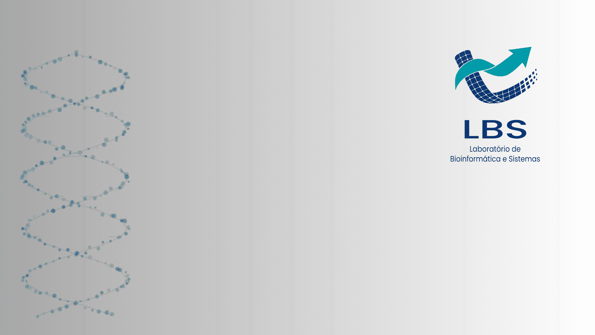
Use the official LBS backgrounds for online meetings, presentations, and events. Dark and light versions are available as Full HD PNG files (1920 × 1080 px, 16:9 aspect ratio).
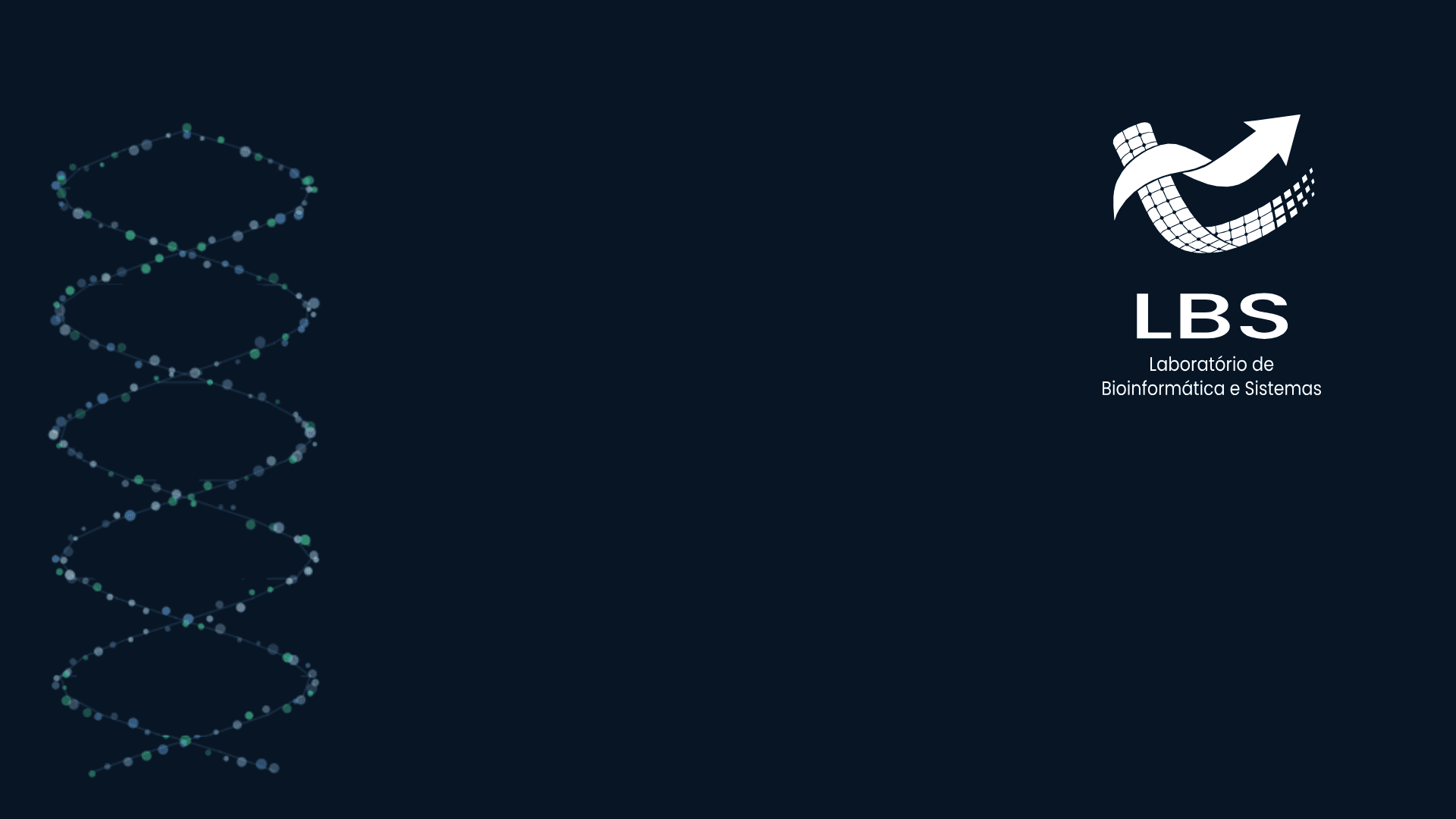
Dark version
PNG · 1920 × 1080 px · 16:9
Download PNG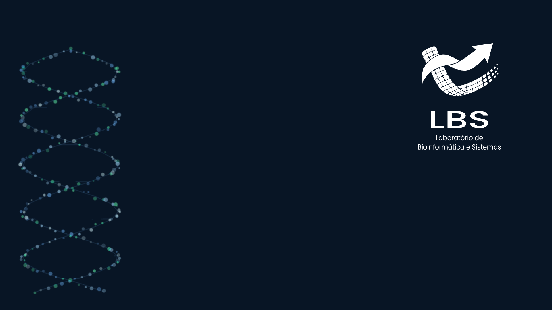
Light version
PNG · 1920 × 1080 px · 16:9
Download PNG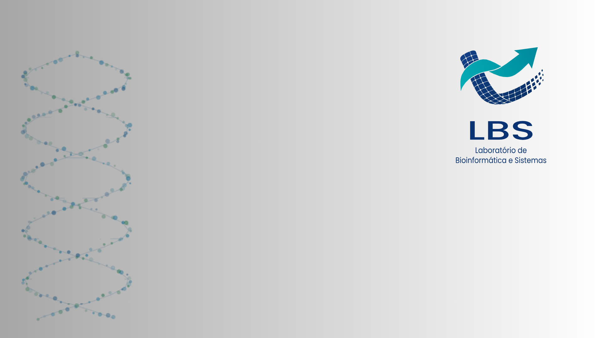
Download your preferred version and select the file as a virtual background in your video call app. Keep the original image without cropping, stretching, or repositioning the logo.
Files
The nine logo versions live in public/logos/ in this repository, each one as an SVG and as a transparent PNG — eighteen files in all. Reach for the SVG whenever you can: it scales without loss. The PNG is there for editors that will not open a vector, such as Word, PowerPoint, and social platforms. Download the full set as a ZIP, or grab an individual file from the cards above.
ZIP · 9 SVG + 9 PNG · ~1.5 MB